
*(Prelim task photos are above final)*

Our prelim nearly follows the rule of 3rds, however due to no establishment we are unsure where the text is set. It's a well framed shot, however there are no titles which are essential and it doesn't really follow the film convention of setting the scene.
Shot rating 5-6/10

not. Shot rating 10/10
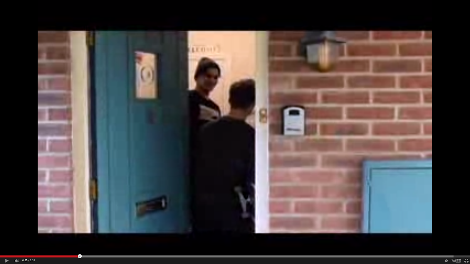


Another error in this prelim shot, despite rule of thirds, it was down w/o a tripod proving to be shaky and lose us marks which we learnt from, by using a tripod for a lll but one scene in our final. In this shot if you watch the mirror closely, you will notice the cameraman is fully visible which doesn't happen in any films.
Shot rating 3/10

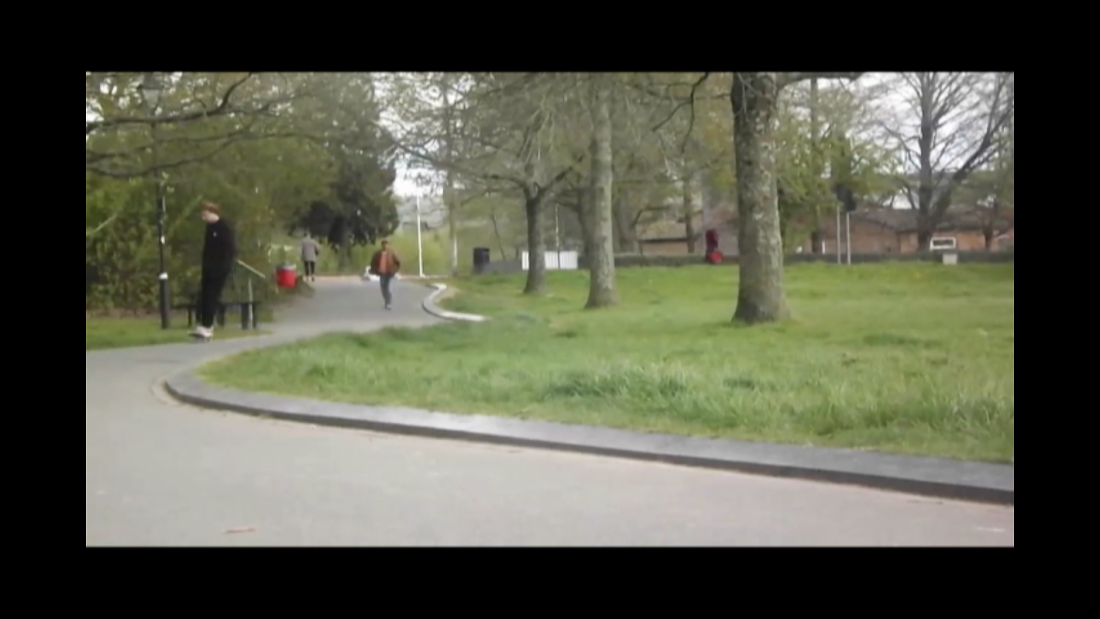
This for me is a clean pan, we pan from the window to our sleeping character - after establishing the home place of our character.
Not too much going on but the pan, which made it perfect for us to add in more titles to fill the scene and direct focus on anything but our character (in bed). The use of a tripod made the shot cleaner and by editing out the Audio we made it possible to remove any unnecessary noise. Shot rating 8/10

Here we have to similar shots, both follow rule of thirds to allow audience to adapt to the surroundings. However basic error in the prelim, NO TRIPOD! Therefore the image was shaky. The lighting is also far worse, if you compare the two, the final is brighter and looks cleaner/sharper because the lighting gives added effect. It's also a basic student shot thats very plain.
Shot rating 3/10
The added dialogue stops this scene from also being plain and works well with the music.
Shot rating 8/10
The following shots are comparisons between the original rough cut, and the nearly finalised product. (Finalised-newer product images are above)

Shot Rating 9/10

Shot Rating 6-7/10

Shot rating 9/10

Shot rating 7/10

 However, comparing the tiles of the shots, the rough cut really doesn't look very good, there is no edit on their appearance, and they look plain and basic. Therefore looking very student-like, ruining the movie effect of a film.
Whereas in the newer edit, the titles look so clean, they can be re adjusted which is currently in process for the final edition. However the font really flows, they're subtle and don't look bland
Shot rating 10/10 (newer)
Shot rating 6/10 (rough)

Shot rating 9/10

Shot rating 6/10
The purpose of these shot analysis' is to prove my advancement of how far i have progressed since the prelim, the second lot may not be my prelim, but they still show proof of my advancement and progression since the prelim. Simply as i have now progressed in that i can myself evaluate shots and how small things can have big impacts, not only but how i can use the primary audiences opinions to choose my shots so they work in favour of the audience. unlike the prelim and rough cuts.


 These two storyboards (reference to animatic post as well), prove how far we have come since the prelim. When making th prelim we just turned up and made a film out of anything. However with weeks of planning i put my arty skills to good use and decided to make a storyboard so we had something to refer to, and help us guide us through shooting to nail shots. Furthermore allowing our shots to be more effective in the final - also with use of a tripod for stability.
 The use of tripods and different angles (crab-establishing shots, and the use of multiple takes) have also helped us, as if one shot had something wrong or out of place (mise-en-scene) we had plenty more shots to refer to. Not only but we could reference the various shots of individual places to our audience. Getting their feedback to improve our film drastically. Looking at the rough cut and final edition, you can really see that we have used different shots, and how much sharper the newer one looks. It has also taught us to use great preparation, as in the prelim we had one shot for every take so they had to be good else our product wasn't good. Which is bad planning as had we taken more takes their would have been a choice and possibly better shots to choose from.


 These two storyboards (reference to animatic post as well), prove how far we have come since the prelim. When making th prelim we just turned up and made a film out of anything. However with weeks of planning i put my arty skills to good use and decided to make a storyboard so we had something to refer to, and help us guide us through shooting to nail shots. Furthermore allowing our shots to be more effective in the final - also with use of a tripod for stability.
No comments:
Post a Comment